UX Design Process: Mental Health App
College students often face the challenge of balancing academic workloads, personal responsibilities, and mental health. While many existing tools such as counseling services and productivity apps aim to help, they often feel disconnected from students’ real, everyday needs. This project focuses on designing a student-centered mental wellness app that empowers users to manage their time, reduce stress, and build healthy routines. Through thoughtful research and user-focused design, the goal is to create a digital experience that promotes balance, well-being, and a sense of control in students’ daily lives.
Personas
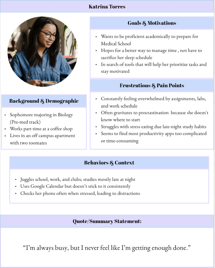

To better understand the needs and challenges college students face, I created two personas that represent the app’s target users. These personas are Katrina and Nathan, highlight different student lifestyles and mental health struggles, from managing time between classes and part-time work to coping with stress and burnout. Developing these profiles helped guide design decisions by grounding the app’s features in real user motivations, frustrations, and daily behaviors.
Empathy Maps


To gain a deeper understanding of my users’ thoughts, emotions, and behaviors, I created empathy maps for each persona. These maps illustrate what students say, think, do, and feel as they navigate the challenges of college life. By visualizing their internal and external experiences, I was able to identify key emotional pain points and discover design feature opportunities that provide motivation, structure, and emotional support in their daily routines.
Concept Maps


To visualize how users would interact with the app from start to finish, I created a series of concept maps outlining different user flows. Each map explores how a student can create and complete a personalized daily routine starting from logging in, selecting tasks, and adding wellness breaks to confirming their plan. These visual frameworks helped define the app’s structure, highlight key decision points, and ensure a smooth, intuitive user experience that aligns with students’ real needs and habits.
Low-Fidelity Wireframes

After mapping out the user flow, I created low-fidelity wireframes to visualize the structure and functionality of the app. These screens focus on layout, hierarchy, and key interactions rather than visuals or color. This stage helped refine usability, ensure smooth navigation, and prepare for high-fidelity design and prototyping.